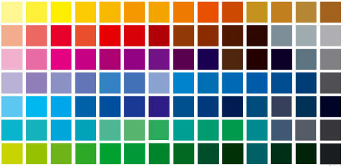
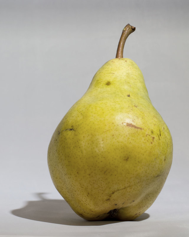
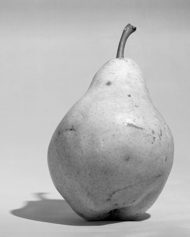
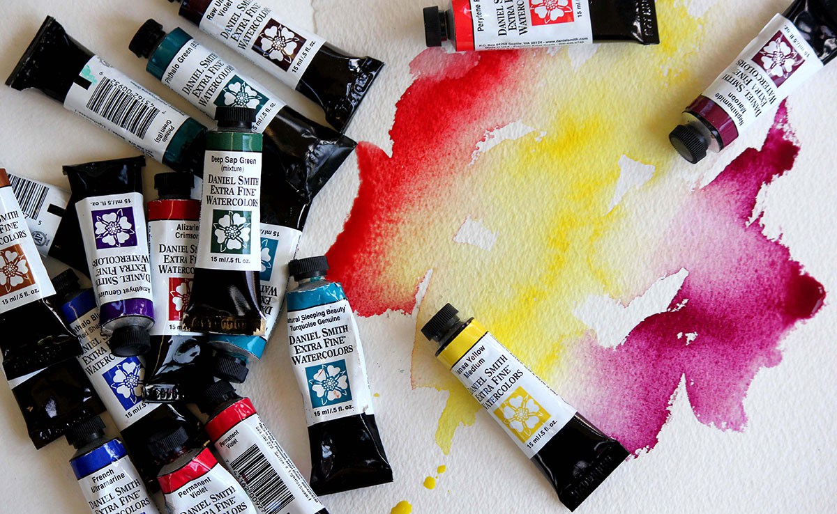
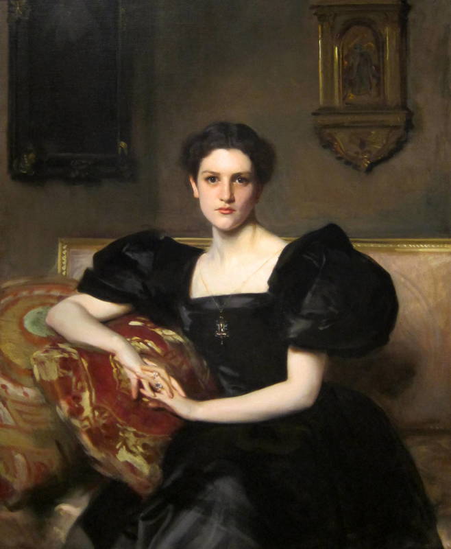
 If you are taking an art class, or trying to learn how to paint via books or on-line, you probably keep coming across these words - colour, hue, tint, shade, tone and value. One of my art students asked me about these various definitions recently and I thought - yep - these can be very confusing. (Especially when I looked up the definition of hue and the synonym was tone .... lilac was used as an example of a hue and artists don't usually call lilac a hue ..... most artists would disagree with the definition I found.) Why the confusion? These terms are defined differently in different industries so you will get varying definitions. In this post I am discussing how these terms are used when an artist or art instructor is discussing a painting. COLOUR Let's start with colour - if someone refers to a colour, we understand what a colour is. Blue is a colour, viridian is a colour, orange is a colour. Experts estimate that the human eye can distinguish up to 10 million different colours. https://hypertextbook.com/facts/2006/JenniferLeong.shtml The fashion, interior design and house paint industry come up with all sorts of fabulous names for all the colours that surround us. A painting is made up of a whole bunch of colours. The terms we are discussing describe the colours used in a painting and how they relate to each other. And when you are learning how to paint, you need to understand these terms. HUE When artists talk about hue, they are describing either pure colour (no white, black, grey or another colour mixed with it) or the dominant pure colour in the colour that is being discussed. These are the colours on a colour wheel. The hues are the primary colours, - red, yellow and blue - and the secondary colours, - green, purple (called violet or magenta sometimes) and orange. 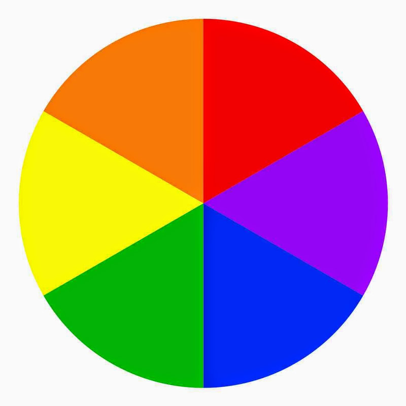 When discussing the dominant colour in a colour we say the hue is ..... The hue of these colours is yellow - 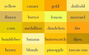 The hue of these colours is green - 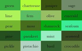 Back to the lilac issue. Most artists would not call lilac a hue because it is not a pure colour. If the colour lilac was being discussed, it's hue would be described as purple (or violet). The colour lilac would be called a tint or a tone. 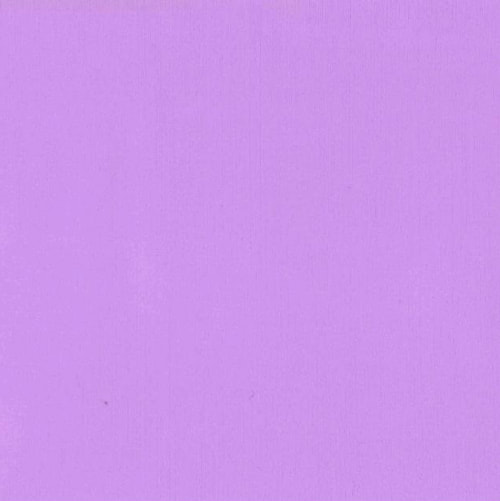 Why would some artists call lilac a tint and some call it a tone? Well .... yet more ways to confuse us about colour ..... it is because my idea of lilac, or your idea of lilac may be different to another person's idea of lilac. Any of the colours in the photo below could be called lilac. And calling it a tint or a tone depends on how a person perceives what is involved in creating the colour lilac. If they see lilac as simply purple plus white - they would call it a tint. If they see lilac as purple plus white plus blue and maybe a bit of black added ..... they would call it a tone. 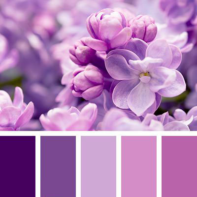 Yep. Confusing. The perception of colour and how to create it is very subjective which is why different people refer to these different terms in different ways. Hopefully the below definitions will clarify the way these terms are generally used for and by artists. 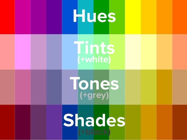 HUE - pure colour (colour wheel colours), no white, black or another colour mixed with it - or referring to the dominant pure colour in a colour TINT - pure colour plus white A tint is just a hue that has had white added to it. The colour lilac can be referenced as a tint if only white is added to the hue violet/purple to achieve it. SHADE - pure colour plus black A shade is simply a hue that has had black added to it. The colour aubergine can be called a shade of violet/purple if black is added to the hue violet/purple to achieve it. If a hue is mixed only with white or black, it stays a pure tint or a pure shade. Once another colour or grey (black and white) is introduced, it becomes a tone. TONE - pure colour plus grey (black and white added) - and sometimes one or more other colours added to the pure colour A tone is simply a combination colour or a greyed down hue, the colours "beige" or "salmon" are tones. Skin tones - think of all of those colours in a face. Combinations of hues with grey create a myriad of skin tones in a portrait. Tones, tints, and shades are all still called colours. Tones, tints, and shades all have different values. Which now brings us to value, often the most discussed and the confusing one. 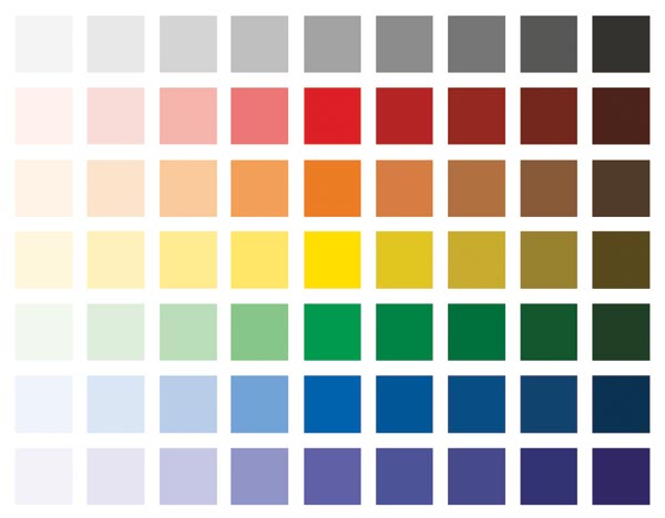 VALUE - the lightness or darkness of a colour, tint, tone or shade. On a value scale, black is at one extreme, white at the other. The colours in the image above move from a light value to a dark value. Shades have dark values. Tints have light values. Values are a big deal in a painting. Correct values establish depth, position objects in a composition, demonstrate accurately the representation of shadow and light, and control the way the eye travels in a painting. When values are off in a painting, the painting doesn't work. Artists often use one of these to help sort out the values in their paintings. 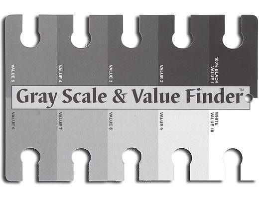 The trick is seeing what value a colour is, as colours confuse our eyes, making it hard to see how actually dark or light they are - what their true value is. Taking a colour image and translating it into a grayscale image before you paint it helps you accurately understand the value of the colours you are dealing with.
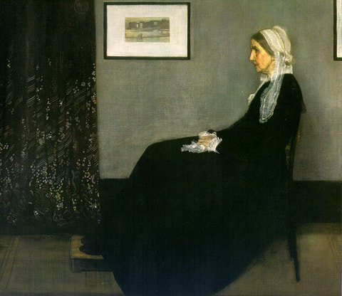
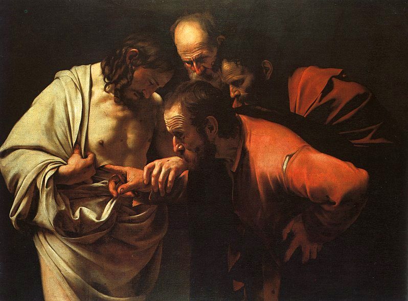
When values are sorted out in a painting, that is when the magic happens. I leave you with James Whistler's "Arrangement in Gray (Whistler's Mother)", Carravagio's "Incredulity of St. Thomas" and Vermeer's "Girl with a Pearl Earring". These three artists were masters at painting values, and the masterpieces below are excellent examples of how the values of different colours are effectively used in paintings.
38 Comments
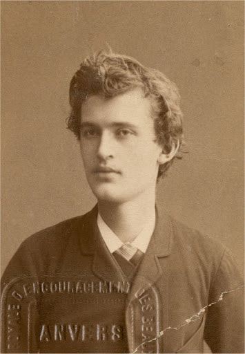
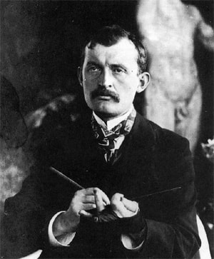
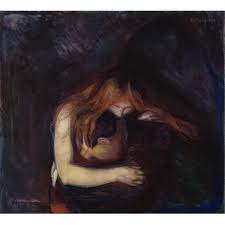
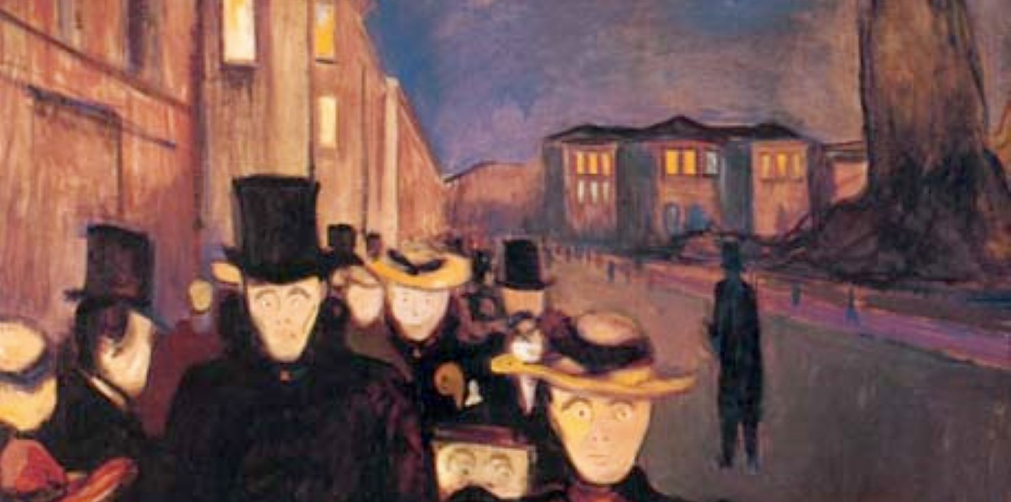
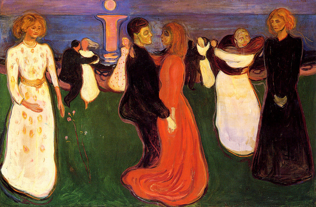
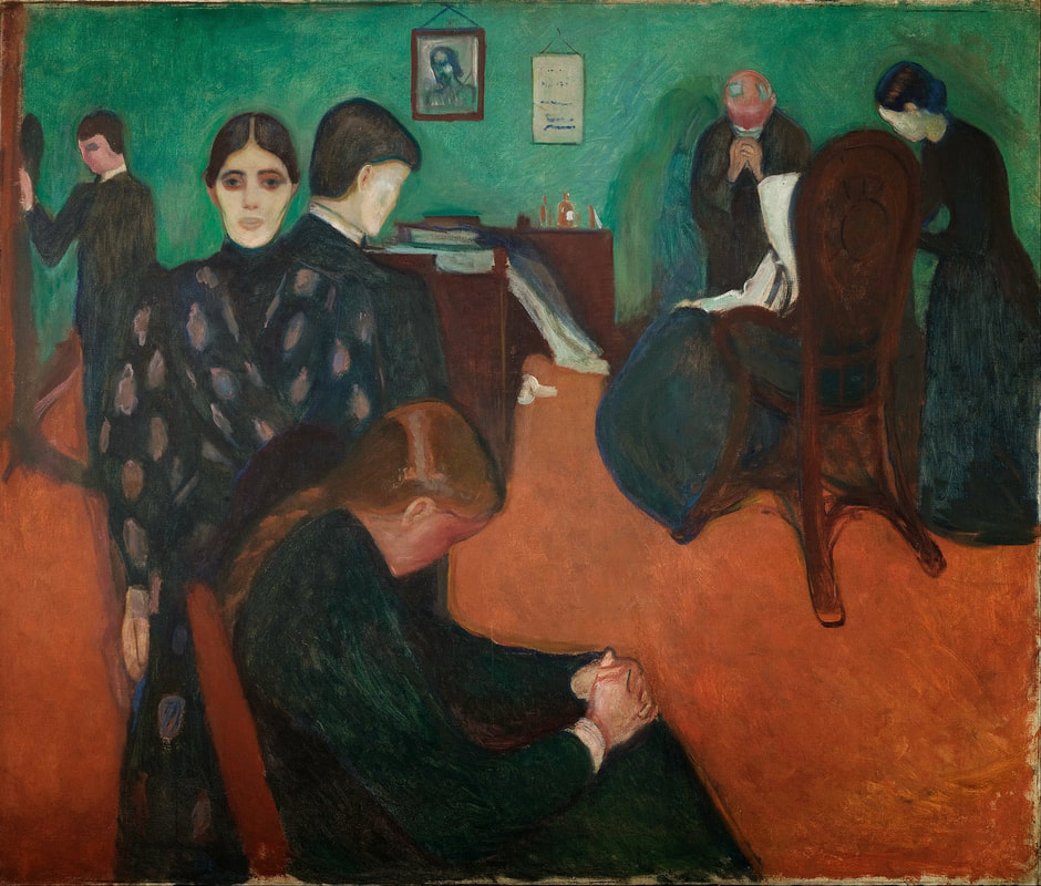
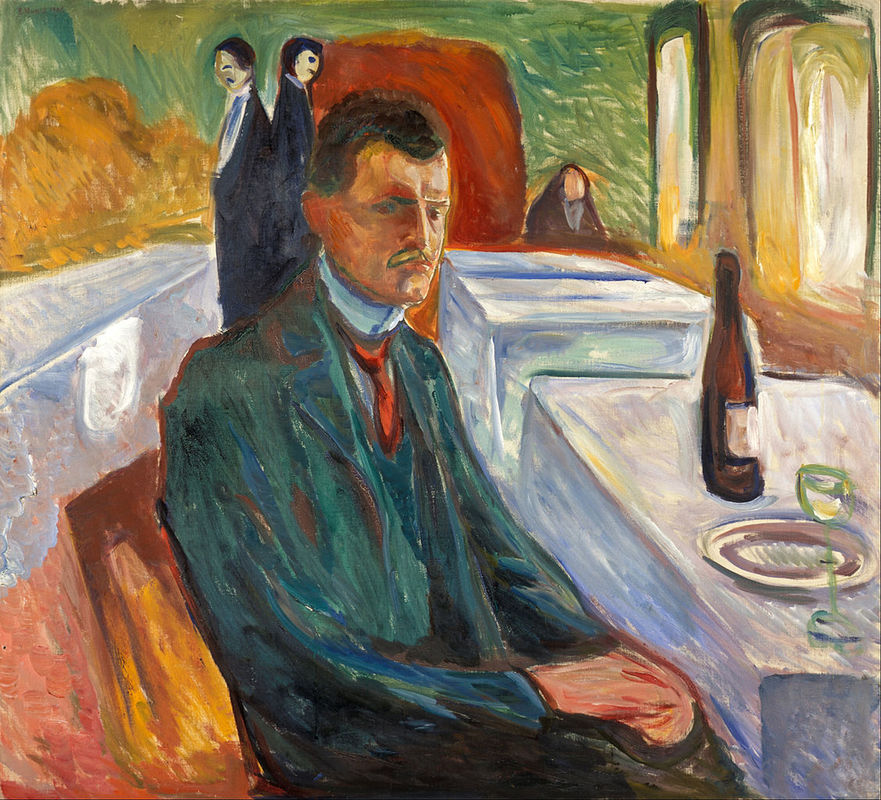
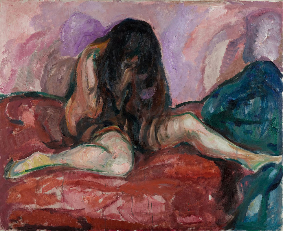
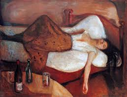
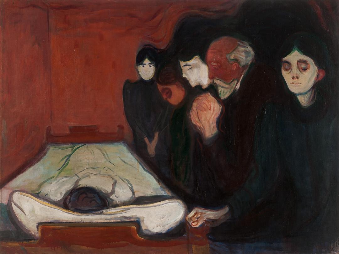
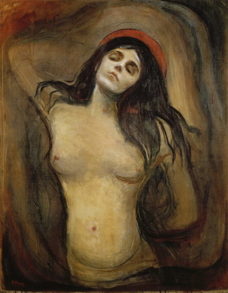
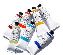
Edvard Munch - 12 December 1863 – 23 January 1944 Born in Ådalsbruk, United Kingdoms of Sweden and Norway "The Scream" by Norwegian Symbolist and influencer of German Expressionism Edvard Munch, is arguably one of the world's most famous paintings and Munch's most recognized work. Munch actually created four versions of "The Scream" - 2 oils and 2 pastels. 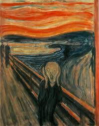 The Scream, 1893 by Edvard Munch On 2 May 2012, Munch's 1895 pastel "The Scream" sold for US $119,922,500. Yes, over 119 million dollars. This is how Munch described what lay behind his extraordinary work "The Scream". "I was walking down the road with two friends when the sun set; suddenly, the sky turned as red as blood. I stopped and leaned against the fence, feeling unspeakably tired. Tongues of fire and blood stretched over the bluish black fjord. My friends went on walking, while I lagged behind, shivering with fear. Then I heard the enormous, infinite scream of nature." Edvard Munch (Faerna, José María (1995). Munch. New York: Harry N. Abrams. p. 16.) "The Scream" touched our psyches and infiltrated our culture as few other works of art have. Was Munch's other work as dark and emotional? Yes. "I do not believe in the art which is not the compulsive result of Man's urge to open his heart." Edvard Munch (Eggum, Arne; Munch, Edvard (1984). Edvard Munch: Paintings, Sketches, and Studies. New York: C.N. Potter. p.10) "My father was temperamentally nervous and obsessively religious—to the point of psychoneurosis. From him I inherited the seeds of madness. The angels of fear, sorrow, and death stood by my side since the day I was born." Edvard Munch (Prideaux, Sue (2005). Edvard Munch: Behind the Scream. New Haven: Yale University Press.) Edvard Munch's work was highly personal - he lived a troubled life and his art reflects this. Edvard Munch grew up in dire poverty and surrounded by illness. Munch's mother died of Tuberculosis when Munch was just 5, he was terribly ill throughout his childhood, and his beloved sister Sophie also died of Tuberculosis when she was 15 and Munch was only 13. He was raised by his father who was a strict Calvinist and suffered from mental illness. After leaving home, he lived a life of self-imposed exile, believing that to be solitary created great art. In 1908, suffering depression, seeing hallucinations and experiencing feelings of persecution, Munch was also dealing with alcoholism. It is here when Munch reached an emotional breaking point and was hospitalized for 8 months. He was never married and had no children. When Munch died, his remaining works were not left to any of his family members but were bequeathed to the city of Oslo, which built the Munch Museum. - 1,100 paintings, 4,500 drawings, 18,000 prints and six sculptures. An extraordinary amount of work. An extraordinary legacy for Norway and for artists and art lovers world-wide. Possibly more than any other artist, Munch expressed in visual form the inner life of modern man. His images of loss, loneliness, anxiety, dread and sexuality touched a chord in viewers that most artists desperately try to reach. To learn more about this extraordinary artist, visit - https://www.edvardmunch.org/ New students wanting to learn how to paint are faced with deciding which medium to choose to paint with. This can be really confusing, so I want to give you a synopsis of the differences between the three types of paints most commonly used - acrylic paint, watercolour paint and oil paint. All paint is made of two things - pigment (the colour - a dry powder) and a binder (this is what holds the dry pigment together and let's you apply it on a support like paper, canvas, wood etc.). The three paints we are discussing use different binders - so each type of paint will dry differently, move differently across the paper or canvas, create different transparencies, and reflect colour differently. It is the type of binder used in each type of paint that makes the paint handle in these different ways. An artist is able to do different things which each type of paint and paint quite different paintings depending on his or her choice of medium. Certain painting techniques work better with certain paints and, certainly, an oil painting does not look like a watercolour. However, every paint produces extraordinary work and the choice will depend mostly on your personality, and your style of art. If you can, try all three paint mediums before you invest heavily in one type of paint. Everybody is different and your personality will likely respond more to one type of paint more that another. If you can't find classes in your area to do that, start with a limited colour palette first - just a few tubes of colour and a couple of brushes to try each medium. Here are some pros and cons of each type of paint to help you choose what to begin with. But seriously, they are all amazing, every medium creates beautiful art. (The photos provided of each medium do not speak to the range that each medium can achieve, but I have tried to select pieces that represent the medium and well-known artists that worked in each specific paint type.)
For inspiration and to see what acrylic paint can do visit the National Acrylic Painter's Association http://www.napauk.com/artists.htm
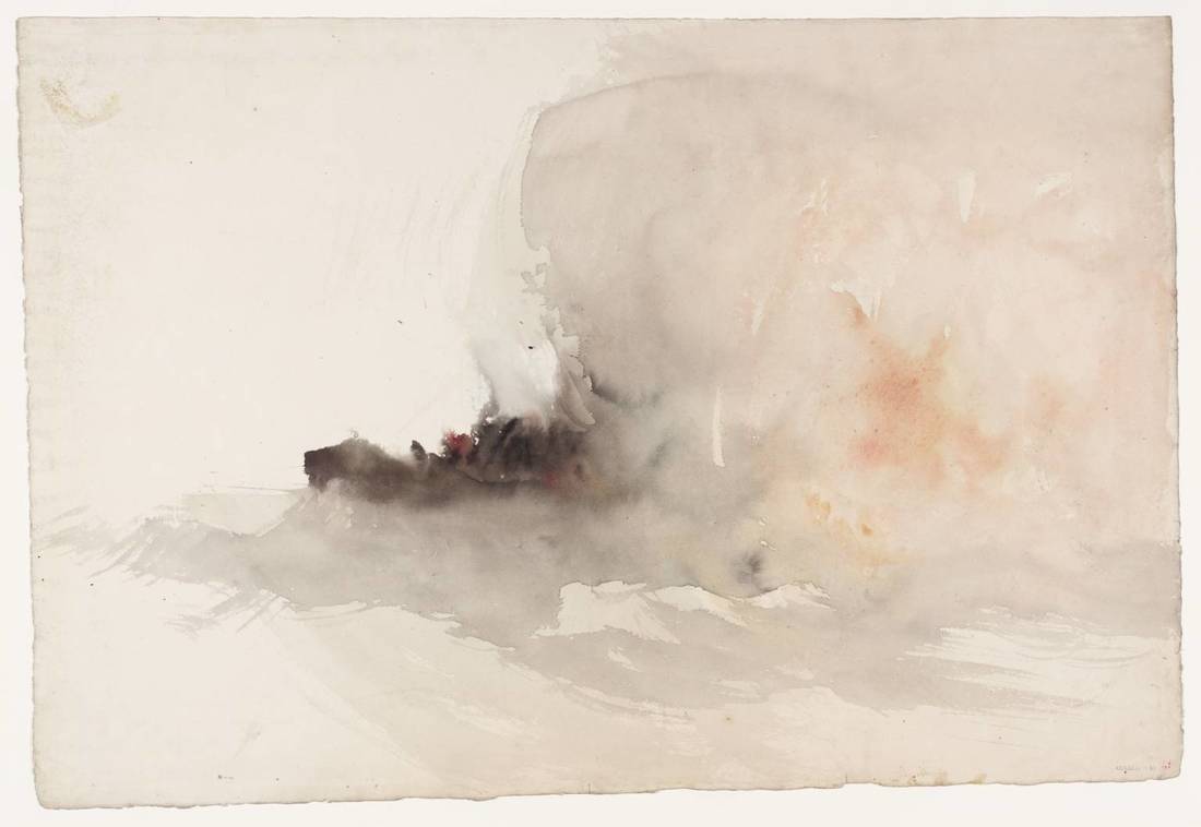
A Wreck, Possibly Related to 'Longships Lighthouse, Land's End' c.1834 - Tate Museum Joseph Mallord William Turner 338 x 491 mm - Watercolour on Paper
For inspiration and to see what watercolour paint can do visit the Royal Watercolour Society https://www.royalwatercoloursociety.co.uk/artists/
For inspiration and to see what oil paint can do visit the Royal Institute of Oil Painters http://theroi.co.uk/roi-members/ |
Kate GreenArtist and Art Instructor living in Ottawa, Canada. ArchivesCategories
All
|


 RSS Feed