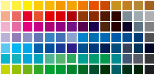
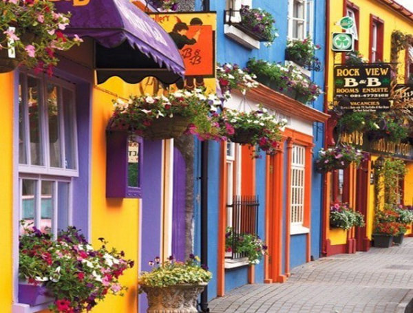
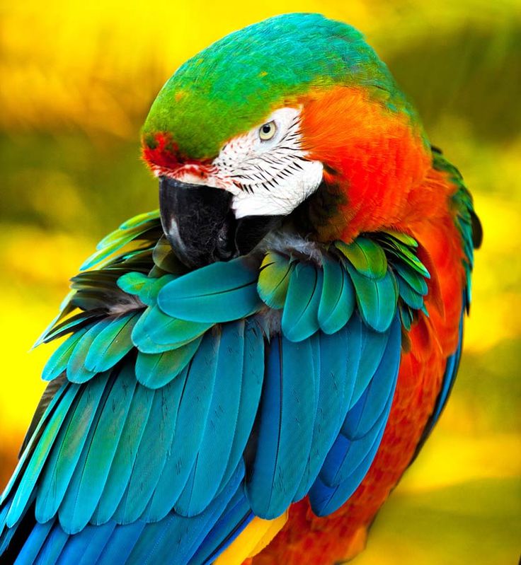
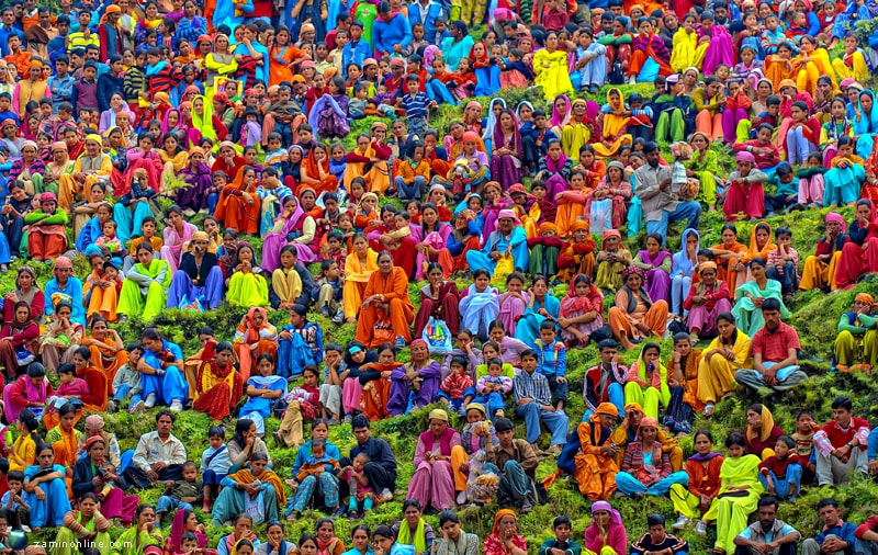
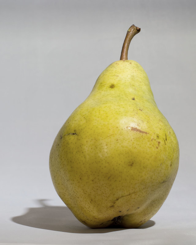
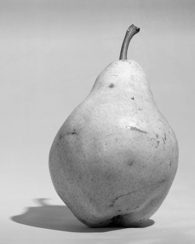
 If you are taking an art class, or trying to learn how to paint via books or on-line, you probably keep coming across these words - colour, hue, tint, shade, tone and value. One of my art students asked me about these various definitions recently and I thought - yep - these can be very confusing. (Especially when I looked up the definition of hue and the synonym was tone .... lilac was used as an example of a hue and artists don't usually call lilac a hue ..... most artists would disagree with the definition I found.) Why the confusion? These terms are defined differently in different industries so you will get varying definitions. In this post I am discussing how these terms are used when an artist or art instructor is discussing a painting. COLOUR Let's start with colour - if someone refers to a colour, we understand what a colour is. Blue is a colour, viridian is a colour, orange is a colour. Experts estimate that the human eye can distinguish up to 10 million different colours. https://hypertextbook.com/facts/2006/JenniferLeong.shtml The fashion, interior design and house paint industry come up with all sorts of fabulous names for all the colours that surround us. A painting is made up of a whole bunch of colours. The terms we are discussing describe the colours used in a painting and how they relate to each other. And when you are learning how to paint, you need to understand these terms. HUE When artists talk about hue, they are describing either pure colour (no white, black, grey or another colour mixed with it) or the dominant pure colour in the colour that is being discussed. These are the colours on a colour wheel. The hues are the primary colours, - red, yellow and blue - and the secondary colours, - green, purple (called violet or magenta sometimes) and orange. 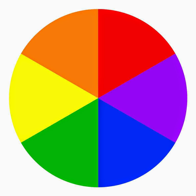 When discussing the dominant colour in a colour we say the hue is ..... The hue of these colours is yellow - 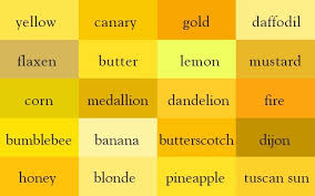 The hue of these colours is green - 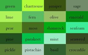 Back to the lilac issue. Most artists would not call lilac a hue because it is not a pure colour. If the colour lilac was being discussed, it's hue would be described as purple (or violet). The colour lilac would be called a tint or a tone. 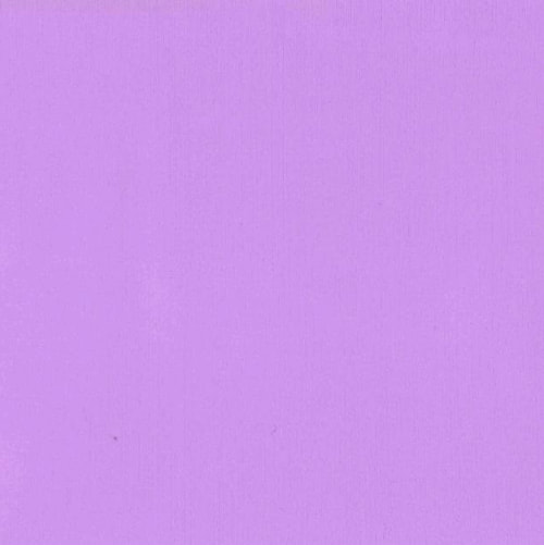 Why would some artists call lilac a tint and some call it a tone? Well .... yet more ways to confuse us about colour ..... it is because my idea of lilac, or your idea of lilac may be different to another person's idea of lilac. Any of the colours in the photo below could be called lilac. And calling it a tint or a tone depends on how a person perceives what is involved in creating the colour lilac. If they see lilac as simply purple plus white - they would call it a tint. If they see lilac as purple plus white plus blue and maybe a bit of black added ..... they would call it a tone. 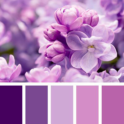 Yep. Confusing. The perception of colour and how to create it is very subjective which is why different people refer to these different terms in different ways. Hopefully the below definitions will clarify the way these terms are generally used for and by artists. 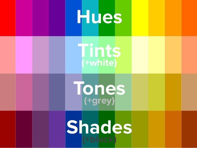 HUE - pure colour (colour wheel colours), no white, black or another colour mixed with it - or referring to the dominant pure colour in a colour TINT - pure colour plus white A tint is just a hue that has had white added to it. The colour lilac can be referenced as a tint if only white is added to the hue violet/purple to achieve it. SHADE - pure colour plus black A shade is simply a hue that has had black added to it. The colour aubergine can be called a shade of violet/purple if black is added to the hue violet/purple to achieve it. If a hue is mixed only with white or black, it stays a pure tint or a pure shade. Once another colour or grey (black and white) is introduced, it becomes a tone. TONE - pure colour plus grey (black and white added) - and sometimes one or more other colours added to the pure colour A tone is simply a combination colour or a greyed down hue, the colours "beige" or "salmon" are tones. Skin tones - think of all of those colours in a face. Combinations of hues with grey create a myriad of skin tones in a portrait. Tones, tints, and shades are all still called colours. Tones, tints, and shades all have different values. Which now brings us to value, often the most discussed and the confusing one. 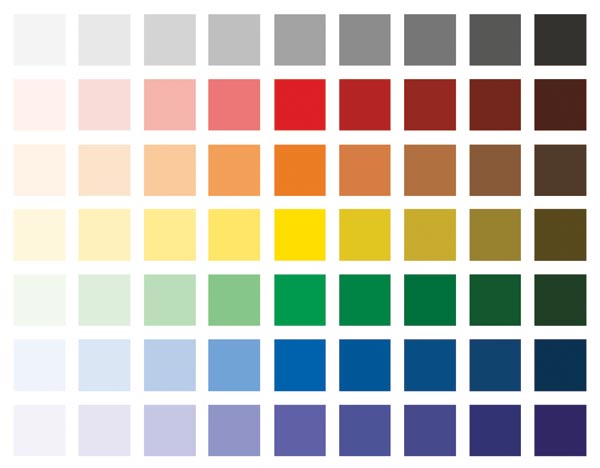 VALUE - the lightness or darkness of a colour, tint, tone or shade. On a value scale, black is at one extreme, white at the other. The colours in the image above move from a light value to a dark value. Shades have dark values. Tints have light values. Values are a big deal in a painting. Correct values establish depth, position objects in a composition, demonstrate accurately the representation of shadow and light, and control the way the eye travels in a painting. When values are off in a painting, the painting doesn't work. Artists often use one of these to help sort out the values in their paintings. 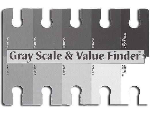 The trick is seeing what value a colour is, as colours confuse our eyes, making it hard to see how actually dark or light they are - what their true value is. Taking a colour image and translating it into a grayscale image before you paint it helps you accurately understand the value of the colours you are dealing with.
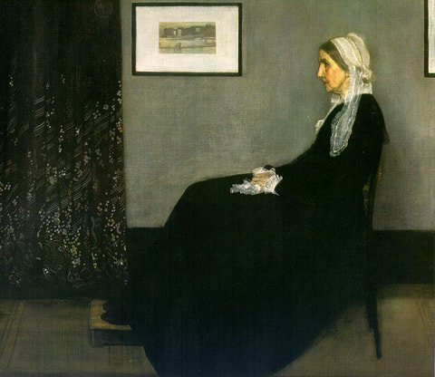
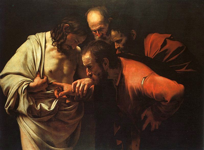
When values are sorted out in a painting, that is when the magic happens. I leave you with James Whistler's "Arrangement in Gray (Whistler's Mother)", Carravagio's "Incredulity of St. Thomas" and Vermeer's "Girl with a Pearl Earring". These three artists were masters at painting values, and the masterpieces below are excellent examples of how the values of different colours are effectively used in paintings.
38 Comments
|
Kate GreenArtist and Art Instructor living in Ottawa, Canada. ArchivesCategories
All
|

 RSS Feed